
A Bolt, a Drop and a New Identity: The Story Behind BWL’s Logos
Posted
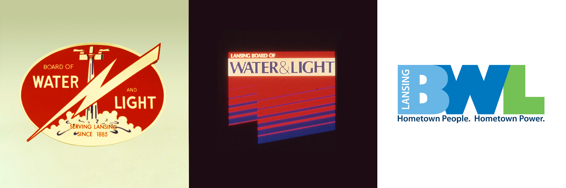
A logo can tell you a surprising amount about an organization.
For the Lansing Board of Water & Light (BWL), the logos that have appeared on trucks, publications and buildings over the years reflect more than changing design trends. They mark different eras of the utility – from its early days of growth to its second century of service and its modern focus on energy, water and the environment.
BWL’s earliest known logo featured a red-and-white lightning bolt, power line and cloud. A fitting image for an electric utility. The logo is believed to date to the 1950s, possibly around the time BWL transitioned to the name “Board of Water & Light.”
The exact timing is difficult to pin down. BWL documents from the mid-1950s show the organization transitioning between “Board of Water and Electric Light Commissioners” and “Board of Water & Light,” while Lansing State Journal articles from the same period used both names. In an old copy of the internal company magazine, Watts and Drops, an article asked readers if they knew anything about the logo’s origins. According to the article, it may have been suggested or sketched by a BWL employee.
The next major change came in 1985, when BWL celebrated its 100th anniversary. The centennial was an opportunity not only to celebrate the past, but to look toward the future. BWL wanted a more modern identity as it entered its second century, and the result was the orange-and-blue logo representing BWL’s two essential services: electricity and water.
The new logo made its debut on BWL vehicles, which were painted with a distinctive green described as “Dr. Pepper” green. A blue-and-white version of the new logo was initially used on those trucks. As vehicles were replaced and repainted light tan, the full-color logo followed. For the next 25 years, orange and blue became the face of BWL.
By 2010, BWL was changing again, and so was its logo. The utility had new leadership, was building new forms of generation, launching new programs and placing greater emphasis on community identity. The new logo was developed following a company logo study and employee feedback, with more than 40 concepts considered before the final design was selected. This time, green joined the blue. Blue continued BWL’s association with water, while also representing trust and stability. Green complemented the blue with associations of cleaner energy and environmental responsibility.
From a lightning bolt and cloud, to orange and blue, to today’s blue and green, BWL’s logos have evolved alongside the utility itself – each reflecting how BWL understood its role and future at that moment in time.